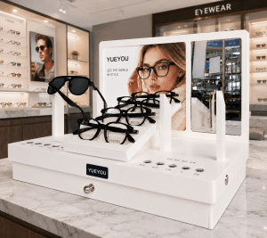
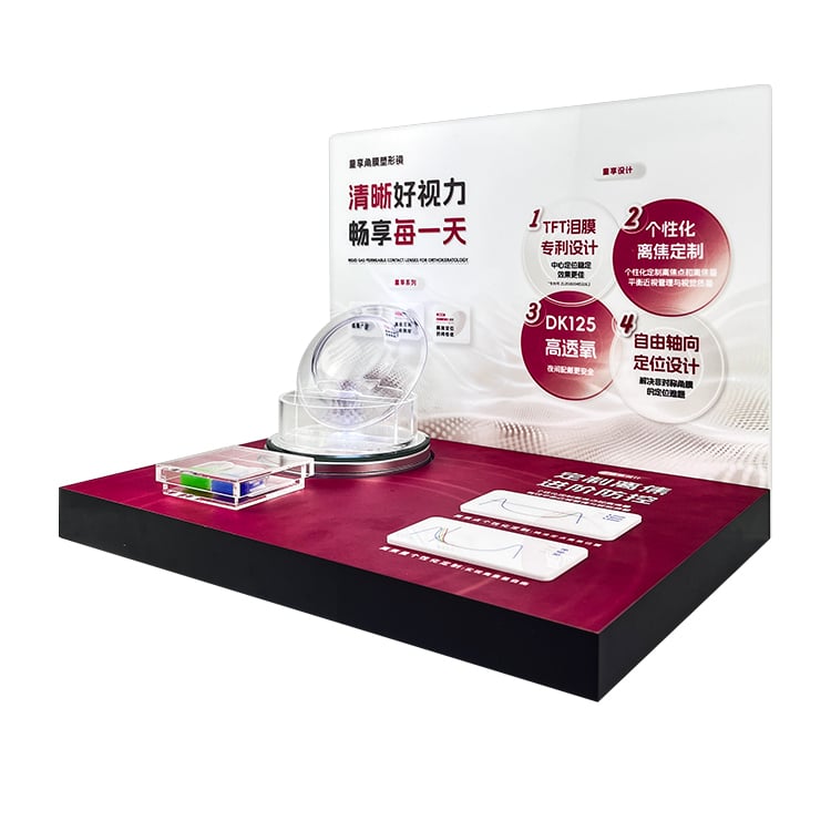
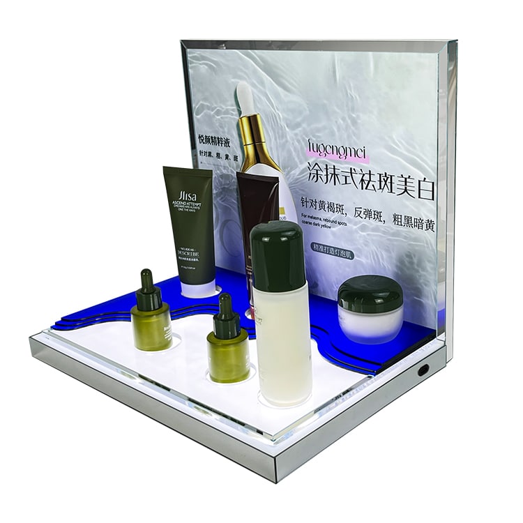
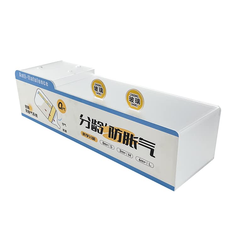
Small retail counters need a cosmetic display rack that makes the product range easy to understand without blocking the shopper’s view or consuming the working space of the counter. The most reliable layout starts with the products and the shopping task, then assigns each product group a clear position, access path and visual priority. A rack should be shaped by the real packaging, the available counter, the replenishment routine and the brand system—not by a generic tier count.
This guide explains how to plan a small-counter cosmetic display rack for makeup, skincare, fragrance and related beauty products. The working examples are planning frameworks, not universal store standards. Final dimensions, materials, capacity and packaging need to be confirmed against the actual products and rollout conditions.
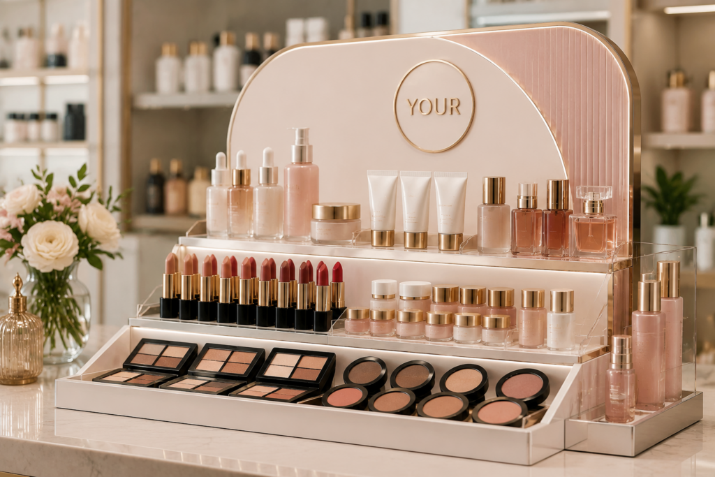
Start with the retail task, not the rack shape
A small counter usually has to perform several jobs at the same time:
- attract attention from the main shopper path;
- show a focused product story;
- let customers pick up or test selected items;
- keep labels and prices visible;
- allow staff to replenish products without dismantling the display;
- leave enough clear space for payment, consultation or other counter work.
These tasks can conflict. A tall back panel may improve visibility from a distance but reduce sightlines across the counter. A deep product tray may hold more units but make the front row difficult to reach. A large logo panel may strengthen brand recognition while reducing the area available for product information. The layout should therefore be evaluated as a sequence of shopper and staff actions rather than as a static object.
Divide the counter into practical retail zones
The following zones provide a useful starting point for a small cosmetic counter. They are a planning framework, not a fixed industry formula.
| Retail zone | Main job | Layout priority | Typical content |
|---|---|---|---|
| Entrance or hero zone | Stop the eye and communicate the campaign | Highest visual position, clean negative space, one clear focal product | New launch, hero skincare set or seasonal collection |
| Browse and comparison zone | Help shoppers compare related SKUs | Consistent spacing, readable labels, direct access | Shades, sizes, formulas or fragrance variants |
| Tester or consultation zone | Support trial, explanation and assisted selling | Stable surface, wipe-down access, room for staff interaction | Selected testers, shade cards, mirror or product information |
| Checkout or add-on zone | Encourage a final low-friction choice | Compact footprint and quick recognition | Travel sizes, gift sets, accessories or replenishment items |
Not every counter needs all four zones. A compact skincare launch may combine the hero and browse areas, while a makeup counter may reserve more room for shade comparison and testers. The important decision is to assign a job to every visible area so that decorative elements do not displace the products that drive the conversation.
Compare layout priorities by retail scenario
The same cosmetic display rack for shop use will not perform the same way in every retail environment. A branded beauty counter may need a strong visual story and room for consultation, while a pharmacy shelf may prioritise fast browsing, clear pricing and easy replenishment. Comparing the use case before choosing the structure helps the buyer request a rack that fits the actual selling routine.
| Retail scenario | Main display task | Suitable layout direction | Key trade-off | Confirm in the RFQ |
| Beauty or brand counter | Present a focused collection and support assisted selling | A compact hero panel with tiered product rows, a defined tester area and a clear brand cue | More branding and consultation space can reduce the number of visible SKUs | Product groups, tester tools, staff working area, brand files and counter dimensions |
| Drugstore or pharmacy shelf | Make everyday products quick to scan, compare and replenish | Open shelves or stepped rows with consistent label orientation and simple grouping | Higher density may improve range coverage but can make smaller packs harder to read | Shelf height, price-label position, replenishment frequency, product sizes and cleaning routine |
| Department-store beauty concession | Create a premium focal point while guiding shoppers through a routine or collection | A structured multi-level display with controlled negative space and a consultation or mirror zone | A more sculpted fixture can improve presentation but may require more assembly and packing planning | Store fixture rules, shopper approach, visual guidelines, assembly method and approved finish |
| Pop-up store or product launch | Explain a campaign quickly and adapt to a temporary footprint | Lightweight modular or knock-down sections with a hero area and easy-to-reset product trays | Fast setup and portability may limit permanent storage, heavy materials or complex hardware | Event duration, transport route, setup time, campaign graphics, product mix and reuse plan |
| Multi-store rollout or e-commerce fulfilment | Repeat the same product story across locations and protect units in transit | Repeatable modules, clear part identification, packing instructions and a layout that is easy to reset | Standardising the display improves consistency but may leave less room for local variations | Store formats, approved sample, carton plan, labels, destination, assembly instructions and change-control process |
This comparison is a planning tool rather than a specification. The final display may combine approaches—for example, a department-store counter can use the visual hierarchy of a brand counter while adopting the reset logic of a multi-store rollout. The design should be approved with representative packaging and the people who will use the display every day.
Measure the products before selecting tiers and trays
Product fit is the first engineering input. Create a product schedule that records the actual package dimensions, approximate weight, opening direction, label position and the number of units required in the display. Include primary packs such as bottles, tubes and compacts, as well as secondary cartons and gift boxes if they will be shown.
The schedule should also record how each SKU is handled. A pump bottle may need a broad, level support area. A lipstick or slim tube may be easier to browse in individual slots. A compact may need a shallow angled ledge so the shade label remains visible. A boxed set may need more vertical clearance than the individual items beside it.
Use the largest packaging in each product group as the starting point, then check the clearances needed for fingers, labels and replenishment. Do not treat a nominal shelf height as sufficient simply because the product technically fits. A product can fit inside a tray and still be difficult to remove, hide the label below the next tier or force staff to reach across another SKU.
Build the visual hierarchy around one focal story
Small counters become confusing when every product is given equal visual weight. Select one focal story for the first glance: a new product, a core routine, a shade family or a giftable collection. The focal group should receive the clearest sightline and the most deliberate spacing. Supporting products can sit below or beside it, while replenishment or add-on items can occupy the compact edge of the display.
The visual hierarchy can be created through position, height, colour blocking, background contrast and controlled negative space. It does not require a large sign or an oversized logo. When the product packaging already carries strong graphics, a quieter stand may create a cleaner presentation. When the packaging is minimal, a back panel, printed graphic or carefully placed brand colour may help the range read as one collection.
Choose a structure that protects access and sightlines
For a small retail counter, the common structural choices are tiered shelves, stepped platforms, slot trays, drawer-style storage, tester sections and compact back panels. The suitable combination depends on the product geometry and the staff routine.
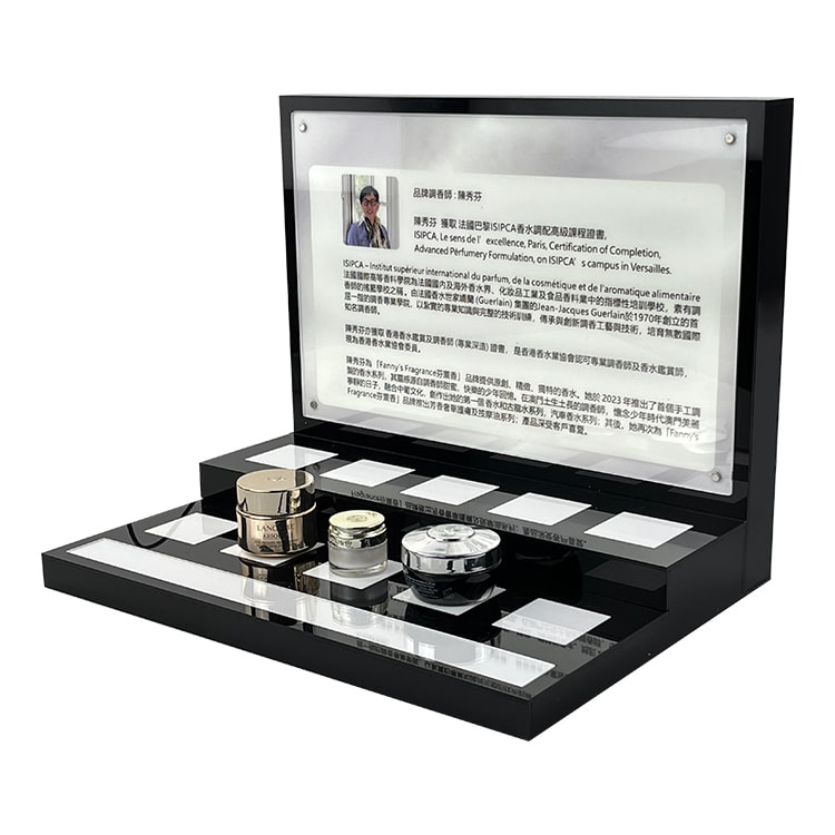
Tiered shelves work well when several packaging heights need to remain visible at once. The spacing should be checked against the tallest item in each row and the hand clearance required to remove it. Stepped platforms create a strong front-to-back hierarchy, but the rear level should not become a storage area that customers cannot reach. Slot trays are useful for slim or repeatable products, provided that the slot width and label orientation match the actual pack.
A drawer or concealed reserve can keep the counter tidy when the display needs back-stock nearby. It adds hardware, access and assembly considerations, so the project should confirm how often staff will open it and how the display will be packed for delivery. A tester area may need a mirror panel, wipe-down surface or small information holder, but each addition should be checked against the available footprint.
The cosmetic display solutions page describes project planning around product fit, brand identity, retail scenario and production feasibility. Those four checks are useful when comparing a simple countertop stand with a more structured display rack.
Keep branding visible without crowding the product
Branding should support recognition and navigation. Before production, define the logo position, colour references, surface finish, printed graphics and any lighting effect that is genuinely needed for the campaign. Keep the main logo area away from the product labels and preserve a clear visual path from the shopper’s eye to the product.
A small counter often benefits from one primary brand cue and one supporting information cue. For example, a back panel can carry the logo while a low front strip identifies a routine or shade group. Multiple competing panels increase visual noise and make the display look smaller. If the product packaging has a precise colour system, request a physical or approved visual reference for the finish rather than relying only on a screen rendering.
YueYou’s public cosmetics solution page lists brand colours, logo placement, surface finish, printed graphics, lighting effects and material combinations as project discussion points. These are options to confirm for the project, not a promise that every display uses every feature.
Plan replenishment and maintenance at the same time
The display should be easy for staff to reset after a busy selling period. Leave a defined route for removing empty packs, restocking reserve units and checking that labels face the shopper. If a tester zone is included, its cleaning and replacement routine should be visible in the working plan. A complex structure that looks impressive but takes too long to reset may perform poorly in a small counter environment.
Surface and edge details also affect day-to-day handling. Smooth, accessible surfaces are easier to wipe than deep recesses. Tight corners can trap dust or product residue. Clear acrylic may make product visibility easier, but the final appearance still depends on the selected finish, fabrication method, assembly and cleaning practice. These details should be reviewed on an approved sample rather than assumed from a 3D drawing.
Validate the layout with a physical sample
Before a bulk order, use a sample or prototype to check the decisions that a drawing cannot fully show:
- Place every representative package in its intended position.
- Check the first-glance view from the main shopper approach.
- Remove and replace products with one hand where the store routine requires it.
- Confirm that labels, shade names and prices remain readable.
- Test the tester or consultation area with the staff tools actually used.
- Simulate replenishment, cleaning and packing for shipment.
- Record any change to product spacing, tray depth, back-panel height or logo placement.
The result should be an approved reference that links the product schedule to the production drawing. If packaging changes after approval, recheck the affected tier or slot instead of assuming that the original layout still works.
Prepare a clear RFQ for a custom cosmetic display rack
A manufacturer can respond more accurately when the request includes the information that controls layout and production. The customization page lists useful inputs such as product dimensions and weight, logo files, target finish, reference display photos, expected delivery market, estimated order quantity and packaging preference.
For a small-counter project, add:
- a product schedule with package dimensions and photos;
- the counter, shelf or gondola dimensions;
- the number of visible SKUs and reserve units;
- the preferred shopper approach and viewing angle;
- the required tester, mirror or information areas;
- brand colour references and approved logo files;
- store photos or a simple plan showing nearby fixtures;
- packing, assembly and destination requirements;
- the inspection points that matter for the approved sample.
The cosmetics display stand category can be used to review the current product range before sending a brief. If the project includes a specific product concept, describe it as a reference direction and ask the supplier to confirm the material, structure, finish and packing method for the final design.
How YueYou can support the planning process
YueYou presents its cosmetics display service around product dimensions, brand identity, retail environments and production requirements. The public solution page also describes countertop, shelf, department-store, pop-up and promotional contexts, along with material, structure, visual-finish and packing discussions. Depending on the project, the team can review a drawing, concept, reference image or brand requirement and develop a sample direction for confirmation.
The exact structure, material combination, electronics, capacity, packaging and delivery terms still need to be confirmed for the product and destination. A useful project brief gives the supplier enough information to make those decisions without turning an unverified assumption into a specification.
Final planning checklist
Before approving a small-counter cosmetic display rack, confirm that:
- each visible area has a defined retail job;
- the largest package in every group has been checked;
- labels and products remain visible from the shopper approach;
- testers and consultation tools have enough working room;
- staff can replenish and clean the display without dismantling it;
- the logo and brand graphics do not overpower product information;
- the sample has been checked with real packaging;
- packing and assembly requirements match the delivery route;
- all project-dependent dimensions, materials and performance requirements are confirmed in writing.
A well-planned layout makes a small counter easier to shop, easier to maintain and easier to quote. It also gives the manufacturer a clearer path from product data to a production-ready display. For a project review, contact YueYou with the product schedule, counter dimensions, brand files and rollout requirements.